DioCal Branding Guidelines
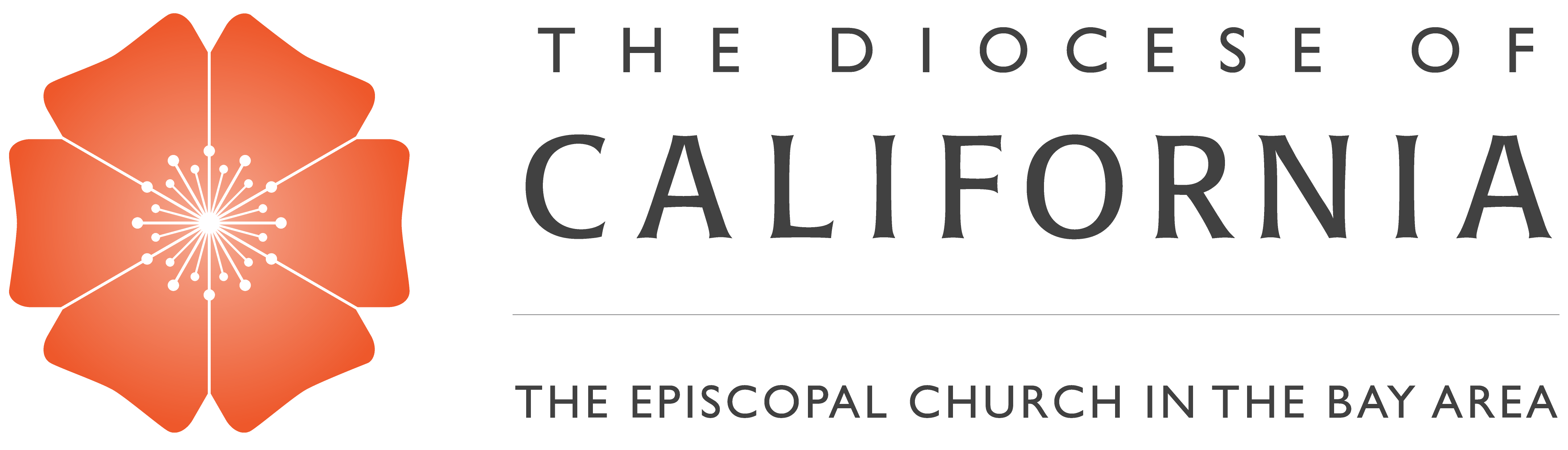
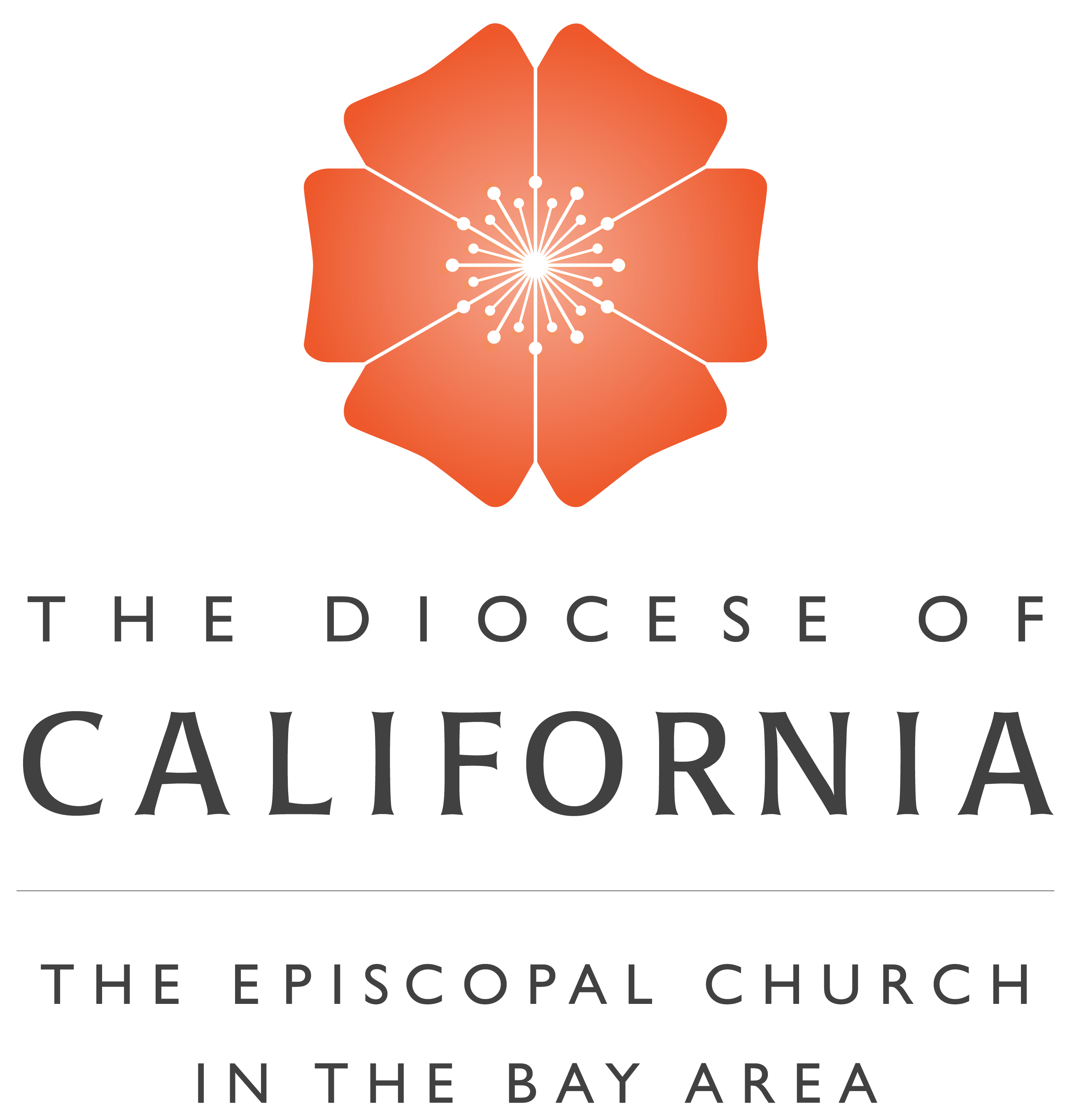
In June 2022, The Diocese of California rolled out a new logo inspired by the state the flower of California, the organic poppy. This simple design grounds our identity in our faith, our home state, and our dedication to caring for all creation. The orange of the poppy reflects the energy and vitality that exudes throughout the San Francisco Bay Area. The flower’s center is designed to resemble a beaming, light-filled cross. Unlike the actual California poppy, which has four petals, our logo flower has six petals to represent our six deaneries (geographical groups of congregations): San Francisco, Alameda, Southern Alameda, Marin, the Peninsula, and Contra Costa.
The logo design was created by Episcopal Impact Fund Communications and Brand Director Kieran King and with the input of Bishop Marc, who designed our previous DioCal logo, as well as a variety of voices from within and outside of our diocese. Paired with our name, which includes “The Episcopal Church in the Bay Area” as its tagline, the new design tells a strong story of our community and our faith, and our commitment to Creation Care, the Episcopal church’s commitment to practice loving formation, liberating advocacy, and life-giving conversation as individuals, congregations, and ministries.
If you have any questions or need help accessing files of the new logo, please contact Working Group Head for Communications Stephanie Martin Taylor at [email protected].
Diocese of California Logos & Seal

DioCal Logo Icon
DioCal Banner Logo
DioCal Vertical Logo
DioCal Seal
If you need the logo or seal in a different size or file type email our Communications Associate Ellie Simpson, [email protected].
Color Palletes and Typography


House Style Guide
The style guidelines for diocesan written communications is available for your use. In general, it follows guidelines found in the Associated Press Stylebook.